Why LinkedIn Visuals Matter in 2025?
On LinkedIn, your images speak before you do.
A sharp visual can grab attention in seconds.
It sets the mood. It makes you memorable.
From your profile picture to your latest post, the right image size can mean the difference between being noticed and being ignored.
Visuals are the first thing your audience sees.
They help you look professional, trustworthy, and up to date.
With competition rising on LinkedIn, you cannot afford to get this wrong.
Table of LinkedIn Image Sizes for 2025
Here’s your quick cheat sheet. Save it. Use it. Share it with your team.
| Content Type | Recommended Size (px) | Aspect Ratio |
|---|---|---|
| Profile Picture | 400 x 400 or higher | 1:1 |
| Personal Banner/Header | 1584 x 396 | 4:1 |
| Company Page Banner | 1128 x 191 | 5.9:1 |
| Post Image (Horizontal) | 1200 x 627 | 1.91:1 |
| Post Image (Square) | 1200 x 1200 | 1:1 |
| Article Header Image | 1200 x 644 | 1.86:1 |
| Event Banner | 1200 x 628 | 1.91:1 |
| Link Preview Image | 1200 x 627 | 1.91:1 |
Bookmark this chart.
It is your LinkedIn image size cheat sheet for 2025.
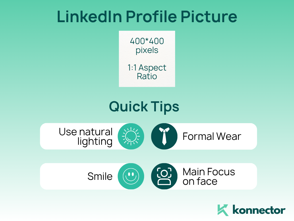
LinkedIn Profile Picture Size: Small Image, Big Impact
Your profile picture is everywhere on LinkedIn.
It shows up in every search, every comment, and every connection request.
Best size:
400 x 400 pixels or bigger, with a 1:1 aspect ratio.
Go for a clear, professional photo.
Avoid group shots and distracting backgrounds.
A simple, clean backdrop keeps the focus on you.
Quick tips:
- Use natural lighting.
- Wear what you’d wear to a meeting.
- Smile. People connect better with warm, approachable faces.
- Crop tightly so your face fills most of the frame.
Pro insight:
Photos with genuine smiles get more profile views and connection requests.
Here are 10 tips for a professional picture!
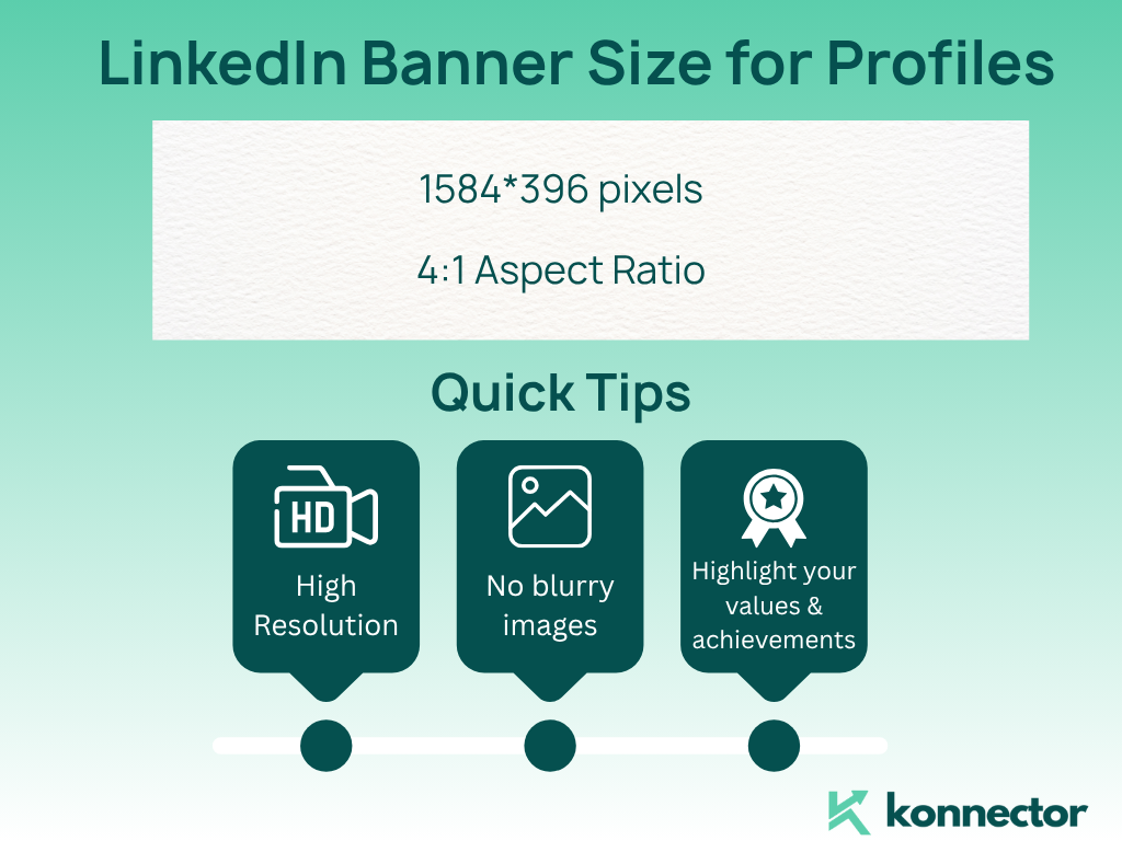
LinkedIn Banner Size for Profiles: Tell Your Story
Your LinkedIn banner is prime real estate.
Think of it as your personal billboard.
The banner sits at the top of your profile, setting the tone for every visitor.
Best size:
1584 x 396 pixels. Keep the aspect ratio at 4:1.
Quick tips:
Go high-res.
Blurry images make your profile look dated.
This is your chance to highlight what you do, your values, or your achievements.
Popular banner ideas:
- A clean brand graphic or logo.
- A photo of you speaking or working.
- A collage of your products or awards.
- A quote that represents your mission.
Don’t overload your banner with text.
Use bold colors that fit your personal or company brand.
Tip:
Test your banner on both mobile and desktop. Important details should sit in the center to avoid cropping.
Read more–>2025 guide to view profiles in an incognito mode
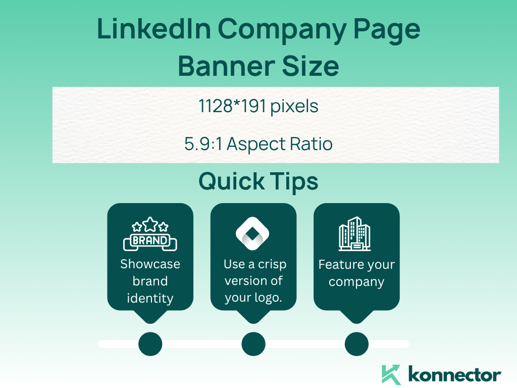
LinkedIn Company Page Banner Size: Brand at a Glance
Company pages are where visitors go to learn about your business.
The company page banner is your opportunity to make a strong first impression.
Best size:
1128 x 191 pixels. The aspect ratio is about 5.9:1.
Quick tips:
This space is ideal for showcasing your brand identity.
Use a crisp version of your logo.
Feature your team, office, or flagship product.
Company page banner ideas:
- Team photos to show company culture.
- Event or conference highlights.
- Graphics that share your brand story or value.
Use visuals that are consistent with your website and other social profiles.
Update your banner often for special campaigns, events, or milestones.
LinkedIn Post Image Size: Get Noticed in the Feed
Posts are the heart of LinkedIn engagement.
Great visuals stop the scroll.
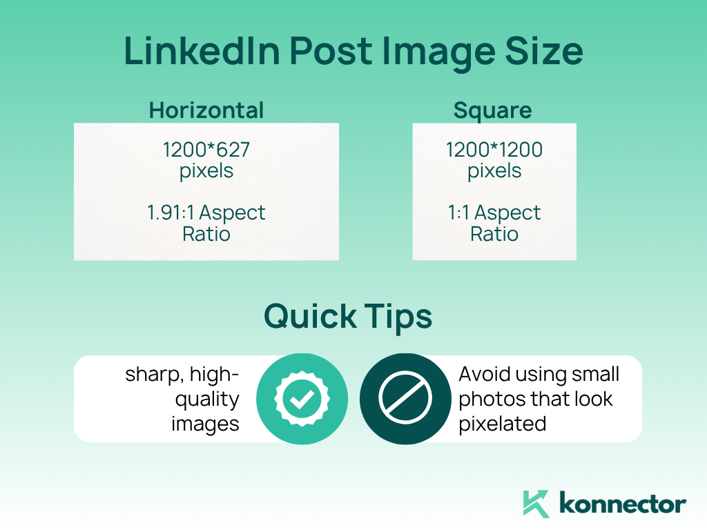
For most posts:
Use 1200 x 627 pixels (horizontal).
For square posts or carousels, 1200 x 1200 pixels works best.
Always go for sharp, high-quality images.
Avoid using small photos that look pixelated when uploaded.
Tips for engaging LinkedIn post images:
- Use bold, easy-to-read fonts for quotes or statistics.
- Keep overlays minimal.
- Stay consistent with your brand colors and style.
Images that reflect your content perform better.
Stock photos are okay, but custom visuals stand out.
Read more—> 30+ LinkedIn Hacks You Should Use in 2025
LinkedIn Article Header Image Size: Lead with Visuals
Publishing articles on LinkedIn?
Don’t skip the header image.
It sets the tone for your readers and draws in clicks.
Best size:
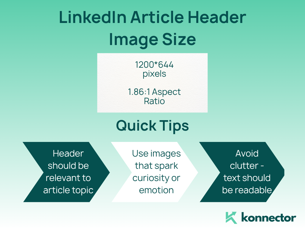
1200 x 644 pixels.
Quick tips:
Your header should be relevant to your article topic.
Use images that spark curiosity or emotion.
Avoid clutter—text should be readable even when the image shrinks in previews.
Tip:
The preview size for featured sections is 600 x 322 pixels. Make sure your header image still looks great at this smaller size.
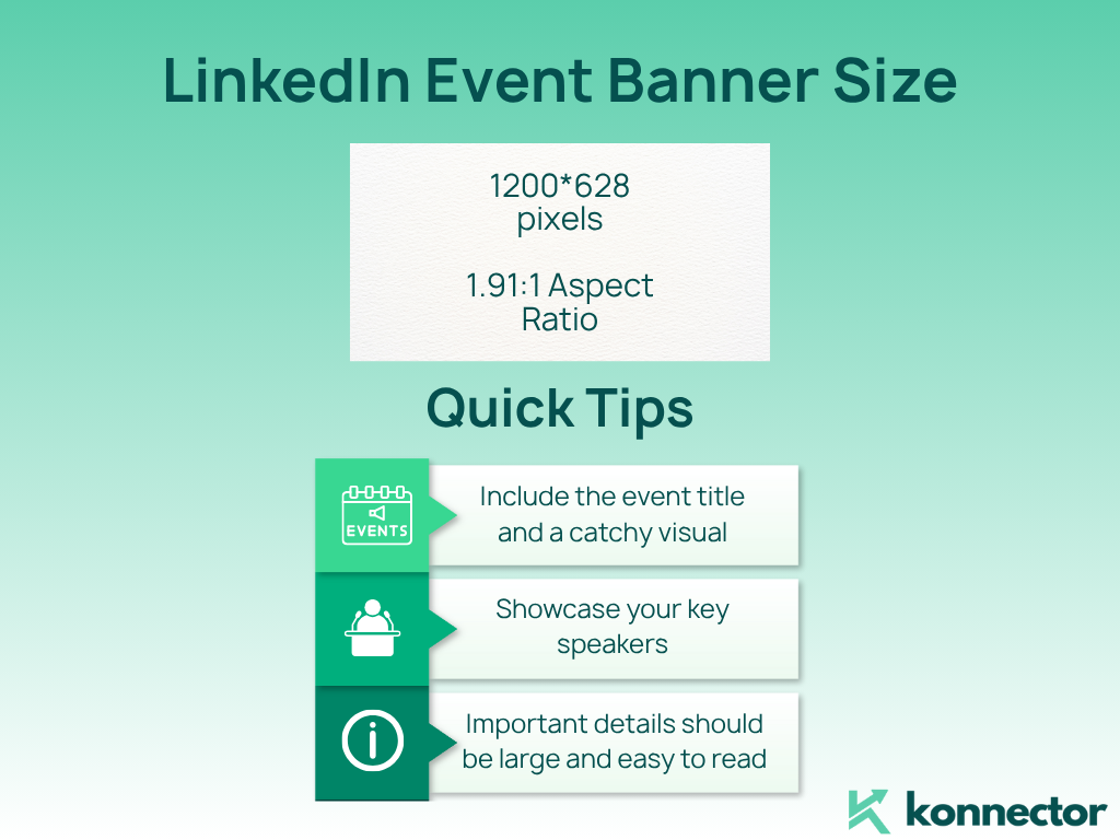
LinkedIn Event Banner Size: Spotlight Your Events
LinkedIn events are more popular than ever.
A good event banner makes your event look professional and attracts the right attendees.
Best size:
1200 x 628 pixels.
Include the event title and a catchy visual.
Showcase your key speakers, especially if they are well-known.
Make sure the most important details are large and easy to read.
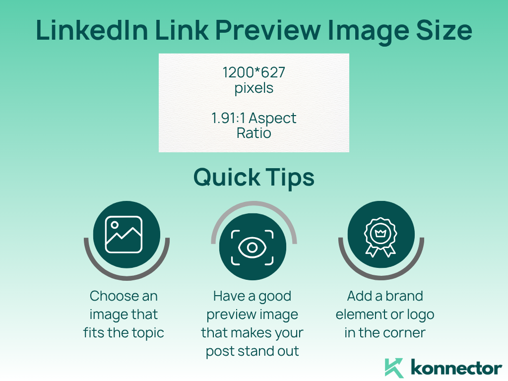
LinkedIn Link Preview Image Size: Make Clicks Count
Whenever you share a link on LinkedIn, the platform pulls a preview image.
If the image is the wrong size, your link might not look its best.
Best size:
1200 x 627 pixels.
Choose an image that fits the topic of your article or landing page.
If you can, add a brand element or logo in the corner.
A good preview image boosts click-throughs and makes your post stand out.
LinkedIn Image Ideas: Get Creative
Not a designer? No problem.
Here are some easy ways to get professional LinkedIn visuals:
- Canva: Search for “LinkedIn banner” or “LinkedIn post.”
Use a ready-made template. Swap colors, add your logo, and download in the correct size. - AI image generators: Try tools like Midjourney for unique, custom graphics.
They’re quick, creative, and easy to use. - Stock photos: Sites like Pexels and Unsplash have thousands of free images.
Search for business, technology, or whatever fits your brand. - Quote cards: Create simple quote graphics for posts.
Use brand colors and big, readable text. - Collages: Mix a few images—like products, people, or awards—for a personal touch.
LinkedIn Visual Trends in 2025
LinkedIn is always evolving.
Here’s what’s trending this year:
- Personal branding: More users are customizing their banners and profile images.
- Bold, clean graphics: Simple backgrounds with sharp images win the day.
- Event visuals: Custom banners for webinars, panels, and launches are everywhere.
- Stock plus custom: Many blend stock backgrounds with personal elements, like product shots or team photos.
- AI-generated images: AI tools are being used for banners, illustrations, and unique backgrounds.
Stay current. Update your images at least twice a year or for every big campaign.
Pro Tips for LinkedIn Visuals
- Use high-resolution images.
- Keep text clear and easy to read.
- Preview your visuals on both desktop and mobile.
- Stay consistent with your colors and logo.
- Don’t overcrowd your images with too much text.
- Refresh your visuals for every big announcement, launch, or milestone.
- Test what works. Change up your visuals and see what gets more engagement.
Final Thoughts: Your LinkedIn Visuals, Upgraded
LinkedIn is a visual-first platform in 2025.
Perfect image sizing is your secret weapon.
It helps your brand look sharp, professional, and ready to win.
Whether you’re building your personal brand, promoting your company, or sharing content, start with the right sizes.
Keep your visuals fresh and on-brand.
And if you want to take your LinkedIn outreach and engagement to the next level, try Konnector.
We make it easy to automate smartly and stay authentic.
Let your visuals—and your message—stand out.
11x Your LinkedIn Outreach With
Automation and Gen AI
Harness the power of LinkedIn Automation and Gen AI to amplify your reach like never before. Engage thousands of leads weekly with AI-driven comments and targeted campaigns—all from one lead-gen powerhouse platform.